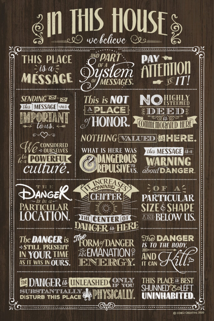
From Wikipedia: Long-time nuclear waste warning messages are intended to deter human intrusion at nuclear waste repositories in the far future, within or above the order of magnitude of 10,000 years. They aimed to communicate a series of messages non-linguistically to future visitors to a waste site.
This place is a message, and part of a system of messages. Pay attention to it!
Sending this message was important to us. We considered ourselves to be a powerful culture.
This place is not a place of honor. No highly esteemed deed is commemorated here. Nothing valued is here.
What is here was dangerous and repulsive to us. This message is a warning about danger.
The danger is in a particular location. It increases towards a center. The center of danger is here, of a particular size and shape, and below us.
The danger is still present, in your time, as it was in ours.
The danger is to the body, and it can kill.
The form of the danger is an emanation of energy.
The danger is unleashed only if you substantially disturb this place physically. This place is best shunned and left uninhabited.
Another senseless product churned out from the Red Tower’s basement! This fun design homages one of my favourite Thomas Ligotti short stories, “The Town Manager” from his 1997 collection Teatro Grottesco. It depicts the destroyed trolley central to the story as well as Comfort Castle, a location described in the text.
In the story, the residents of an American small town are subjected to the whims of a mysterious Town Manager, an unseen authority who rearranges the townsfolk’s way of life in a sinister fashion. To say more would be to spoil some of the story’s dark delights.
This was the system in which we had functioned for generations. This was the order of things into which we had been born and to which we had committed ourselves by compliance. The risk of opposing this order, of plunging into the unknown, was simply too much for us to contemplate for very long.
Thomas Ligotti, “The Town Manager”
What can I say? Sometimes you just have to make a wacky graphic tee with a reference that five people on Earth will get. The image was designed after Disneyland advertisements of the 1950s. I enjoy their bold, simple illustrations and tried to channel their design and colour schemes. Honestly, I made it solely for myself to wear and I’m just sharing it on the off, off chance that it might be fun for some other Ligottesques out there.
So there you have it! Be the toast of the next NecronomiCon in a lovely pink Ligotti-themed shirt, or wear it to casual day in the Nightmare Network, where you work, and I work, and we all work, forever.
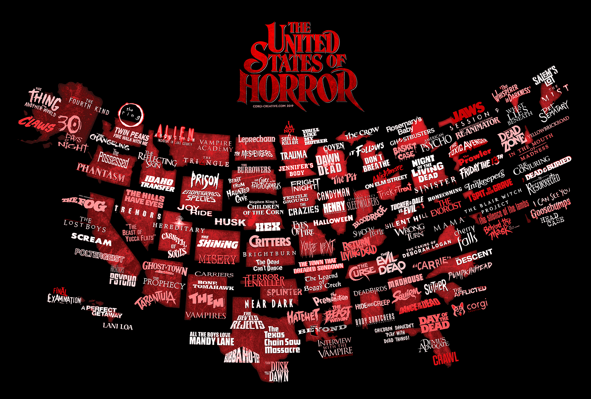
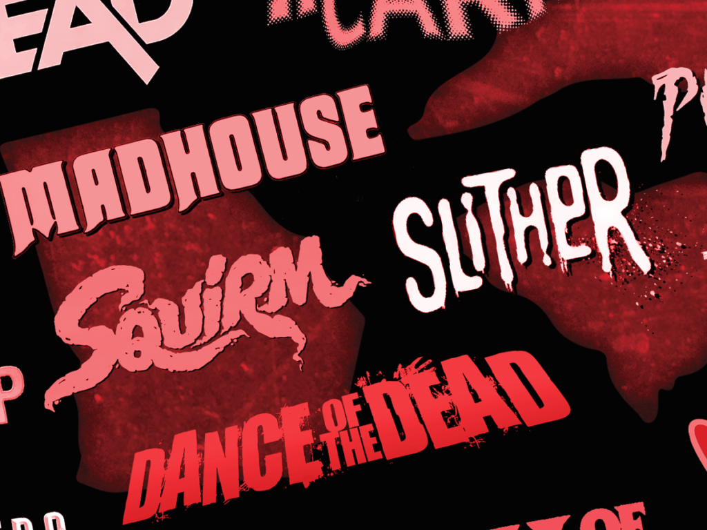
The United States of Horror: A Movie Map of the USA
Note: Due to copyright issues surrounding use of film titles (many of which are now franchise logos) this image is not available for sale.
But they can’t stop you from printing it out at work.
As the tagline for Session 9 states of its real-life Danvers Asylum setting, “Fear is a place.” As a genre, horror tends to be concerned with space. It’s a genre of atmosphere and ambient menace — of looking deeply at surfaces of environments to find the cracks within. It’s hard to think of a horror flick that isn’t concerned with its setting, whether it be a mist-shrouded forest, a grimy maze of urban alleys, or a towering Victorian mansion.
In horror, history never really dies. It lingers in the environment
like a contaminant, slowly polluting the world around it, like the
coal fires of Silent Hill or the toxic waste of Tromaville. And the
effect isn’t limited to the imaginary. The real-life cruelties of
colonialism and slavery, the shocking tragedy of true crimes, the
natural disasters and animal attacks, the inexplicable freak
accidents, the bloodthirsty religious fervours – all soak the local
soil in blood.
In the fullness of time this provides rich fodder for folklore and
urban legends and, of course, horror stories. In a way that other
genres do not, horror lets us grapple with the terrible truths of
where we came from and where we stand – they let us see the ghosts
that can’t be banished.
If this sounds like a pretentious preamble to nothing in particular,
well… it is. But that’s
the rationale behind this project: A horror map of the United States
of America. It’s a collision of some of my favourite things:
horror, typography and cartography. Here I pay homage to some of my
favourite films and their classic posters.
This list is based on the settings of the films, rather than their location of shooting. For a film to be included on the map, it has to make some in-universe reference to the state in which it takes place. For instance, Brian de Palma’s Carrie and John Carpenter’s Halloween were both filmed in California, but the films take place in other states — thus marking Halloween for Illinois and Carrie for North Carolina. Similarly, Jaws is marked for Massachusetts, where fictional Amity Island is located, despite being filmed in New York state. There are dozens of other examples. A map based on shooting locations would indeed be totally different — and heavily skewed toward California.
Which movie ‘belongs’ to which state is the subject of some debate, because horror folks tend to be nerds, and I’m both. Some lists have claimed Psycho for Arizona due to its opening scenes, and others claim it for California, where the Bates Motel is located. The Silence of the Lambs takes place across the borders of multiple states. In these instances I’ve tried to split the difference, as well as adding enough films that residents of each state won’t feel cheated by an omission.
Of course, it’s impossible to include every important horror film from each state. California has enough to fill a whole map by itself. So there are sadly some significant omissions. When possible I’ve tried to represent different types of horror films on offer, so that one subgenre such as slashers or zombies or monster movies doesn’t crowd out the others in any given state, or on the list in general.
Some states simply have slim pickings when it comes to horror flicks, requiring deeper dives into lesser-known territory. This has resulted me including some rare gems, such as Lani Loa and The Dead Can’t Dance. In addition to being educational research for myself, I think this helps shake up the list, showing a broad spectrum within the horror genre rather than being simply another display of acknowledged canon. Obscure, underground, and forgotten films are as important to the genre as the classics. Every horror fan’s shelf should have a pile of films that only five other people have seen and only one enjoyed.
Further, I make no claims to the quality of every film on the list. Some of them are classics, and others… are not. Some of them I haven’t seen. Some merely have a cool logo, as far as this image goes. But you know what they say: Every movie is someone’s favourite movie. This is even more true when it comes to regional pride — so they all deserve to be here, and more.
As for the big question, are these all horror flicks? Some have made a case for Deliverance for Georgia (which I haven’t included), and some others may not consider Ghostbusters or Vampire Academy to be horror enough for the list. But I think the latter two have a certain genre fidelity or spirit of horror that Deliverance doesn’t, even though Deliverance is the most grueling watch of the three. Similarly, some lists have included Close Encounters of the Third Kind to represent Wyoming, but I’ve switched it out for the more horror-based Endangered Species instead. A lot of this rationale, as with all lists and all genre barriers, is totally subjective. It won’t please everyone, and it can’t.
Visually, this map is mostly a showcase of horror typography, so when selecting sources for inclusion such as film posters, I went with the most appealing type I could find across various regional posters and marketing materials. This was naturally easier to do for older films, with their beautiful and unique hand-lettering, rather than the abundance of Trajan and Garamond we see today.
Shout-out also to New England for throwing off every possible balance of state sizes when it comes to making maps like this. Oh well. As long as they keep us awash in Stephen King and H.P. Lovecraft classics, I won’t complain.
The original is in very high resolution. Finding and finessing the appropriate resources required a lot of time and patience, as you can imagine…
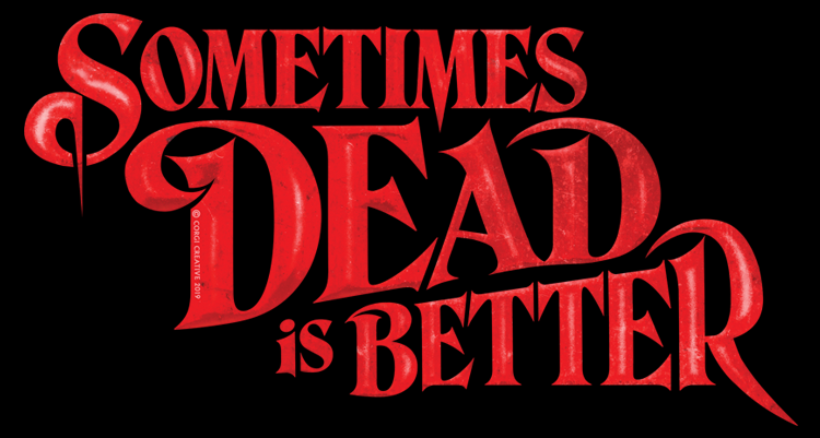
Stephen King’s 1983 novel “Pet Sematary” has had a hold on my imagination for most of my life. To this day I’d consider it the scariest thing I’ve ever read, although my opinion is probably coloured by the fact that I first read it when I was about nine years old.
Mary Lambert’s 1989 film adaptation, which I watched around the same time, still informs my mental image of the book’s events. An avuncular Fred Gwynne as Jud Crandall, scalpel-wielding Gage, ghostly Victor Pascow in his silly red shorts, and the uncanny Zelda, cartoonish yet deeply horrifying to my childish eyes.
All together, one of the best horror stories ever told. I’ve tried to pay tribute to the story in the form of this classic quote from Jud Crandall. 1980s horror paperback covers remain a fascination of mine and I’ve tried to stick close to that unique look. The typeface is an extensively modified Hawthorn, all handcrafted flourishes, just like they did in the old days.
“Sometimes dead is better,” Jud says to a grieving Louis Creed, warning his friend against tampering with the forces of darkness and resurrection. Louis didn’t listen. How about you?
Horror fiends click over to Teespring and warn the world!
If you’re a reader of sci-fi / fantasy you may have heard the word “grimdark.” It’s a fairly recent neologism, coined by fans of the elaborately macabre Warhammer 40,000 fictional universe, whose tagline describes the “grim darkness” of its bleak future. The word “grimdark” came to describe the often over-the-top, satirical bleakness and violence of the setting.
Over the last decade or so, “grimdark” has applied to a wide range of fictional universes and creators, in a more or less tongue-in-cheek fashion. Some authors have applied it to their own work — one early example being Joe Abercrombie, author of the darkly comic (and comically dark) First Law series.
The word is, more or less, a meme.
As such, any real definition of the term remains murky. “Grimdark” isn’t a set of aesthetic tropes or settings like, say, steampunk. It encompasses a wide spectrum of authors and individual works — gritty, often horror-infused, generally involving antiheroes in ‘dark’ or dystopian, quasi-historical settings. (If you guessed Game of Thrones would be accused of grimdark, you’d be right.) Small communities and fanbases have formed around “grimdark” fiction to discuss and share and, inevitably, market such works, but usually without a strict definition of the term.
The category’s wide banner is, I think, one of the keys to its popularity. Grimdark is above all a feeling, and its nebulous nature is fertile grounds for discussion of all kinds of works by all kinds of creators. As you might say about another certain derided genre of art, “I know it when I see it.”
Naturally, there’s been a backlash against “grimdark” both as a term and a concept, and a backlash to that backlash. Grimdark even has vocal detractors, who use the word pejoratively to describe works they dislike, typically fantasy texts perceived as insufficiently optimistic. Right-wing writers at Breitbart have decried the “bankrupt nihilism” of this type of fantasy, and liberal-trending online reader communities have decried it on almost identical grounds. There are, in the mix, overlapping debates about the potential hazards of thematic pessimism on sensitive or suggestible readers, and about the role of privilege among (mostly white, mostly male) authors with regards to depicting certain forms of oppression and violence.
Underpinning many of these debates are competing philosophies, often unarticulated and perhaps unexamined at the root, about the moral purpose of fiction. In this essay, I will…
No. No, I won’t. I came here to post a dang t-shirt.
Point is, I think “grimdark” is a hilarious word and a vibrant community. George R.R. Martin, Joe Abercrombie, Glen Cook, Anna Smith Spark and a whole host of “grimdark” authors have brought me great reading pleasure over the years, and sparked lively conversations with people I’ve come to call friends.
I’ve decided to honour them with this t-shirt design inspired by early extreme metal pioneers like Obituary, Sepultura and so forth — the grimdark of music.
“Grimdark” of course is not an existing band, but you’ll feel very metal wearing it. Click onward to Teespring and get your own!