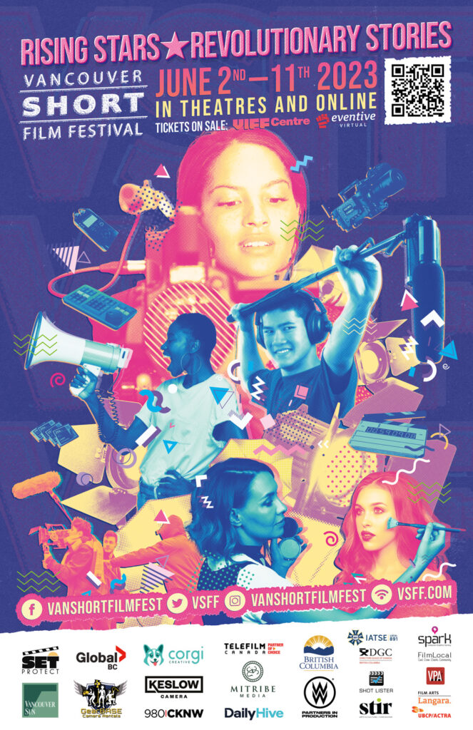
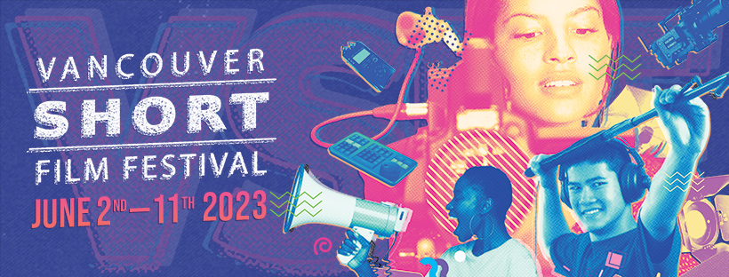
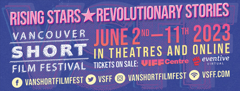
A set of promotional graphics and video for 2023’s Vancouver Short Film Festival. I created many variations on these designs (website and social media graphics, print materials, on-screen theatre images, etc.) but they derived from the main elements of the poster here. The motion graphic below was displayed on an LED billboard on Granville Street for several weeks in May 2023.
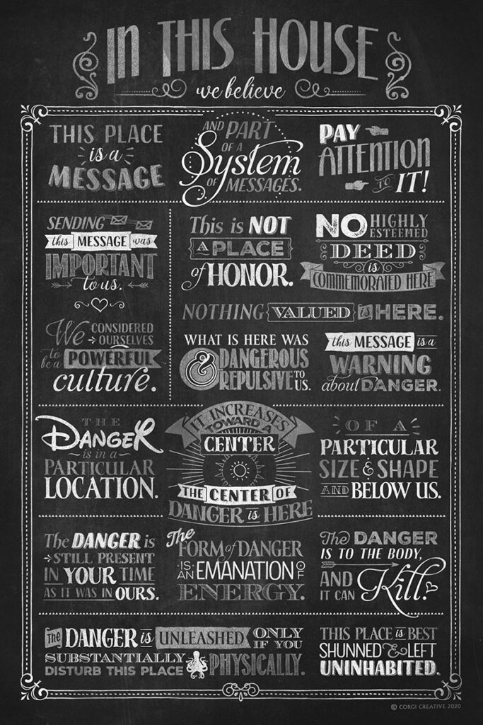
A belated and final addition to the popular “In this House” poster line, a chalkboard-style version to match any decor. Click to head on over to Spring and check it out!
There’s also a basic black version on backgrounds of varying colours. Whatever you need, I’ve got it.
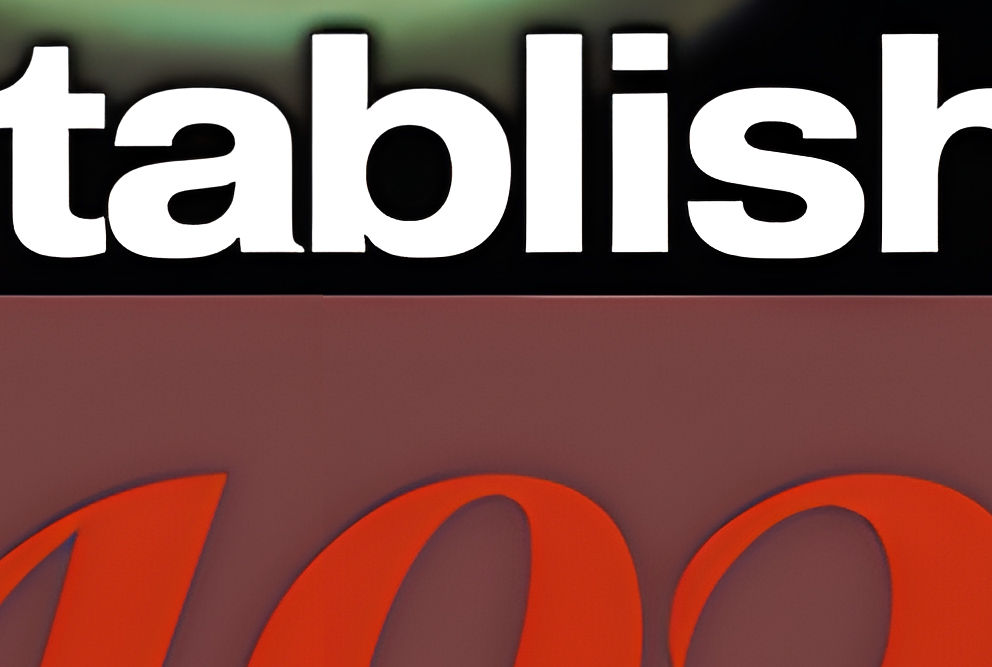
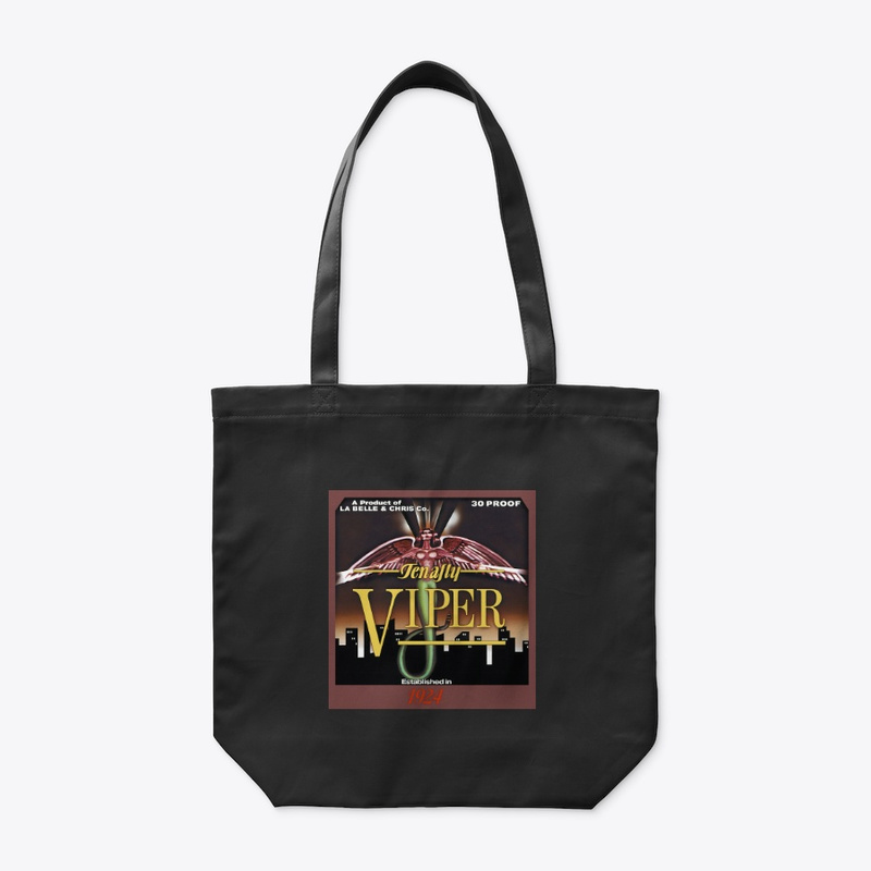
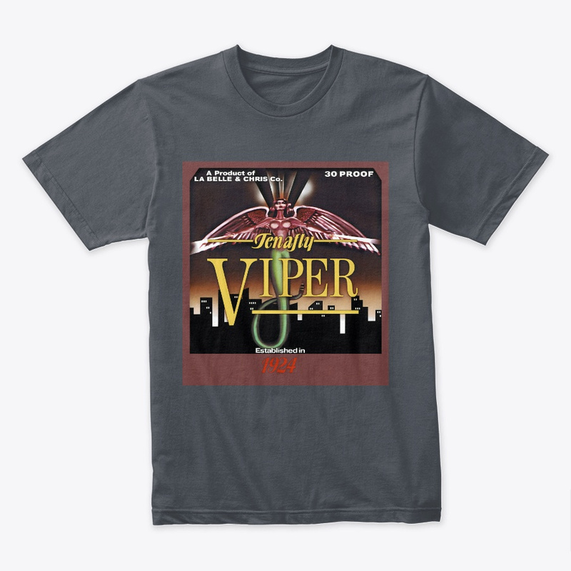
My tribute to the infamous 1987 horror-grime classic film. A fully revamped, ultra-high-resolution version of the label for Tenafly Viper, the lethally toxic, flesh-melting liquor seen in the film. How high-res, you ask? Well, big enough for a poster, if necessary:
I won’t bore you with all the details, but it took hours to properly upscale, clean up the art (and in some parts re-paint it), re-create the original text from scratch, and make the whole thing sharper and cleaner than ever seen before. If it still looks a little janky, well, remember that the original art was about four inches wide. The credit, of course, goes to the original art team of the film: Production designer Robert Marcucci, art directors Denise Labelle and Tom Molinelli, and the art department.
Now available on fine products at Spring. Here’s a sampling but there’s plenty more past the click.
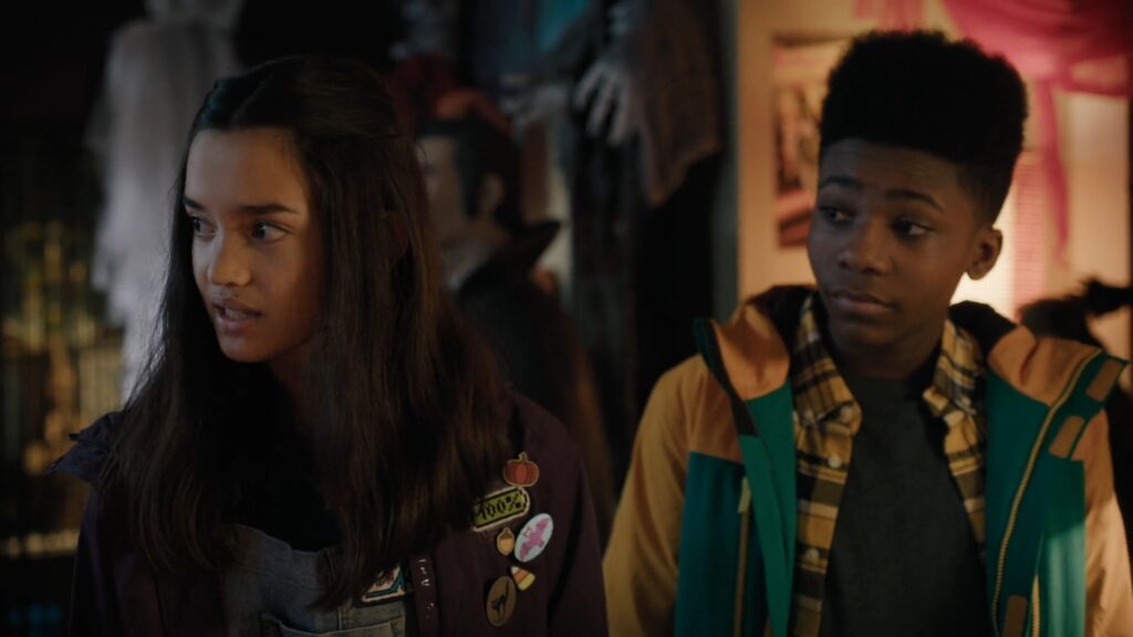
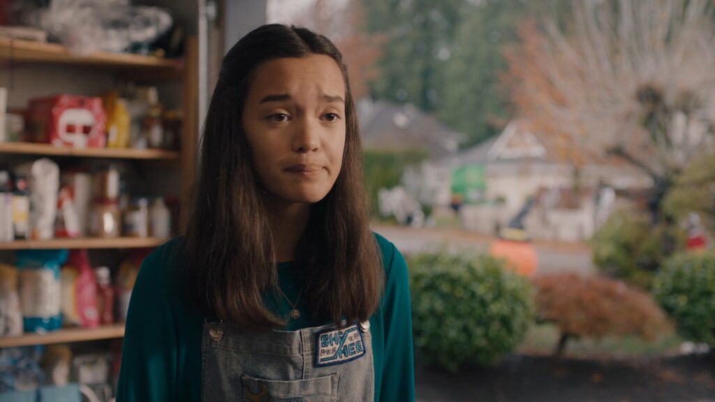
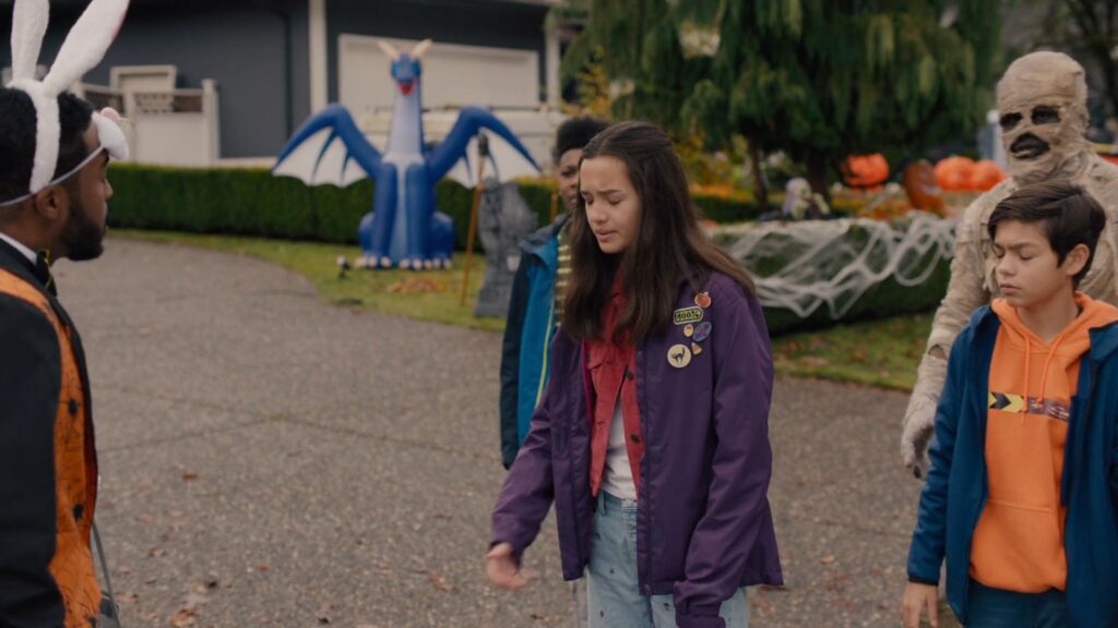
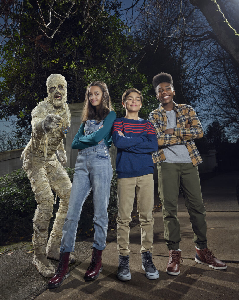
The movie’s finally out so I can talk about this! If you’re a subscriber to Disney+ or have seen the Disney Channel anytime in October of 2021, you might’ve seen Under Wraps, the Vancouver-lensed remake of the 1997 film. I had the opportunity to work with the costume department for this Disney feature, designing numerous custom patches and designs that Seams Weird brought to life with embroidery, including a moon-and-stars, a she/her pronouns insignia, and numerous bats and spiders for the character “Amy” played by Sophia Hammons. Amy was described to us by the department head as a quirky, politically-conscious girl who enjoys spooky imagery, so we tried to capture that in our work.
I’m not sure if everything I designed made it to the screen, but here’s what I could find when I watched the film. Very exciting! Sadly, since we weren’t on set, we don’t get closing credits or IMDB listings for our work, but that’s how this industry goes sometimes. So I post it here instead. My she/her design also made it into the promotional photo material, which is very cool.
Subscribers can check out the film on Disney+ right now!
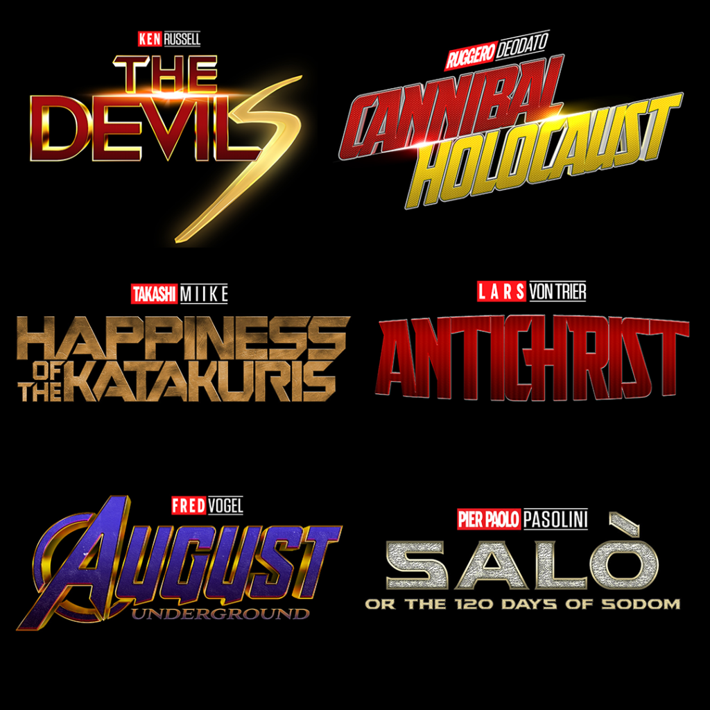
Parody (Non-actionable! Totally legal! I hope!) designs mashing up M*rvel movies with “extreme” cinema. This was only a Twitter shitpost (read: a joke) using some free Photoshop templates available online, but I got carried away trying to make them look authentic and then I figured, what the hell? May as well post them here. Yes, I’m aware my alleged sense of humour will be the death of me and my career one day. Anyway, this required a surprising amount of painstaking custom typography; fonts alone simply aren’t enough to get the look right.
These designs are also available on my Teespring if you want to advertise your sicko status. I will not be held responsible for damaged reputations or relationships sustained by the wearing of these images.
Films include:
Takashi Miike’s The Happiness of the Katakuris, parodying Guardians of the Galaxy
Ken Russell’s The Devils, parodying Captain Marvel
Ruggero Deodato’s Cannibal Holocaust, parodying Ant-Man vs. The Wasp
Lars von Trier’s Antichrist, parodying Ant-Man
Pier Paolo Pasolini’s Salò, or the 120 Days of Sodom, parodying Thor: Dark World
Fred Vogel’s August Underground, parodying Avengers: Endgame
You, dear reader of taste and culture, have no reason to watch these films. Frankly you shouldn’t even Google them. (I’m talking about the MCU, of course; you should watch The Devils immediately.)