Who's excited for Game of Thrones Season 5? I know I am. As a reader of George R.R. Martin's sprawling saga since before the turn of the millennium, I held out on watching the show for several seasons, convinced that no TV show could ever capture the books, and that the hype was just the usual chatter that surrounds anything heavily-promoted. Turns out, I was wrong. "Game of Thrones" is a fantastic piece of entertainment that earns its hit status and then some.
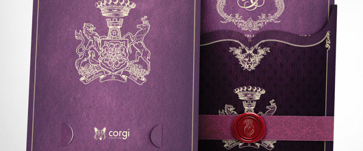
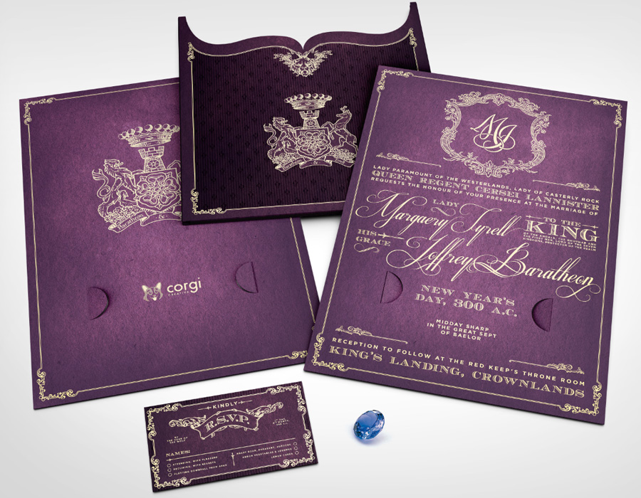
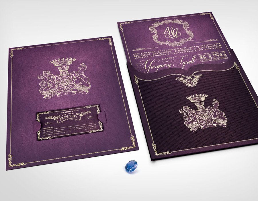
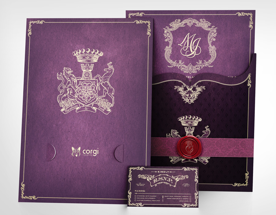
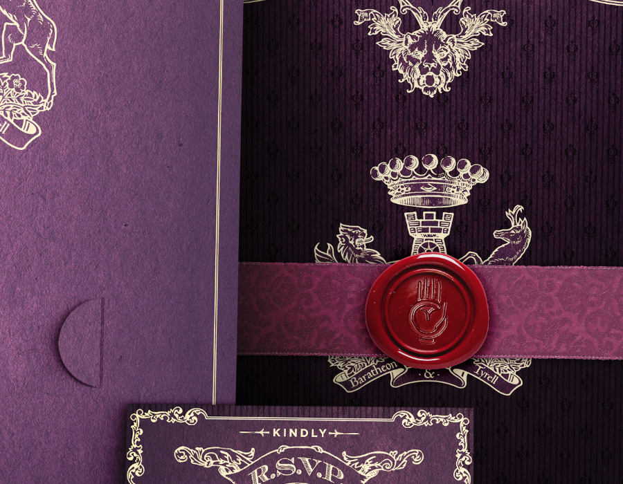
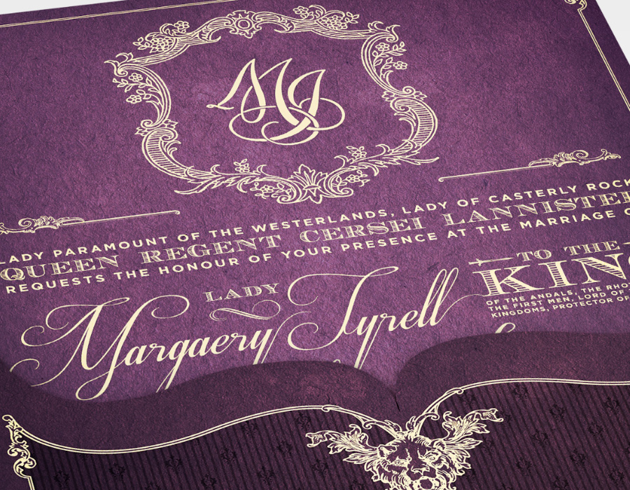
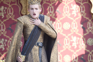
Anyone who's spent time in Westeros knows that weddings aren't the happiest of occasions. Sure, there was Robb's marriage to Jeyne (or Talisa in the show), but only for a while. My personal favourite is, as the fans nicknamed it, the Purple Wedding, where monstrous boy-king Joffrey Baratheon got his just desserts. And it's the Purple Wedding I decided to honour with this project, a conceptual mockup of wedding invitations merging historical and modern styles. The content mostly explains itself, but check the notes below for details. Hope you like 'em!
Nerd Notes: The “coat of arms” motif is intended to represent the union of Joffrey Baratheon and Margaery Tyrell. The design incorporates the emblems of Joffrey’s parents, the Lannister lion and the Baratheon stag, and those of Margaery’s parents, the Tyrell rose and the Hightower keep. (There’s also a seven-pointed star as seen in “Game of Thrones”.) The basis of the design is actually the Alberta coat of arms.
Credits: Medieval design and heraldry elements from WikiMedia and various stock sites. Monogram from a scanned 19th-century book at Project Gutenberg. Mockup template from Envato. "A Song of Ice & Fire" series by George R.R. Martin.

